As we explained in the previous chapter, HTML
elements enable Web page designers to mark up a document as to its
structure. The HTML specification lists guidelines on how browsers
should display these elements. For example, you can be reasonably
sure that the contents of a strong
element will be displayed bold-faced. Also, you can pretty much
trust that most browsers will display the content of an h1 element using a big font size... at least
bigger than the p element and bigger
than the h2 element. But beyond trust
and hope, you don't have any control over how your text appears.
CSS changes that. CSS puts the designer in the driver's seat. We
devote much of the rest of this book to explaining what you can do
with CSS. In this chapter, we begin by introducing you to the
basics of how to write style sheets and how CSS and HTML work
together to describe both the structure and appearance of your
document.
Rules and Style Sheets
To start using CSS, you don't even have to
write style sheets. Chapter 16 will tell you how to point to
existing style sheets on the Web.
There are two ways to create CSSs. You can either
use a normal text editor and write the style sheets "by hand," or
you can use a dedicated tool - for example a Web page design
application - which supports CSS. The dedicated tools allow you to
create style sheets without learning the syntax of the CSS
language. However, in many cases the designer will want to tweak
the style sheet by hand afterwards, so we recommend that you learn
to write and edit CSSs by hand. Let's get started!
H1 { color: green }
What you see above is a simple CSS rule that
contains one rule. A rule is
a statement about one stylistic aspect of one or more elements. A
style sheet is a set of one
or more rules that apply to an HTML document. The rule above sets
the color of all first-level headings (h1). Let's take a quick look at what the visual result of
the rule could be:
We will now start dissecting the rule.
Anatomy of a rule
A rule consists of two parts:
- Selector - the part before the left curly
brace
- Declaration - the part within the curly
braces
The selector
is the link between the HTML document and the style. It specifies
what elements are affected by the declaration. The declaration is that part of the
rule that sets forth what the effect will be. In the example
above, the selector is h1 and the
declaration is "color: green." Hence, all h1 elements will be affected by the declaration, that
is, they will be turned green. (The color property just affects the foreground text color,
there are other properties for background, border, etc.)
The above selector is based on the
type of the element: it selects
all elements of type "
h1." This
kind of selector is called
type
selector. Any HTML element type can be used as a type
selector. Type selectors are the simplest kind of selectors. We
discuss other kinds of selectors in
See CSS
selectors. , "CSS selectors."
Anatomy of a declaration
A declaration has two parts separated by a colon:
- Property - that part before the colon
- Value - that part after the colon
The property
is a quality or characteristic that something possesses. In the
previous example, it is color.
CSS2 (see separate box) defines around 120 properties and we can
assign values to all of them.
The value is
a precise specification of the property. In the example, it is
"green," but it could just as easily be blue, red, yellow, or
some other color.
The diagram below shows all ingredients of a rule. The curly
braces ({ }) and colon (:) make it possible for the browser to
distinguish between the selector, property, and value.
Grouping selectors and rules
In designing CSS, brevity was a goal. We figured
that if we could reduce the size of style sheets, we could enable
designers to write and edit style sheets "by hand." Also, short
style sheets load faster than longer ones. CSS therefore includes
several mechanisms to shorten style sheets by way of grouping
selectors and declarations.
For example, consider these three rules:
H1 { font-weight: bold }
H2 { font-weight: bold }
H3 { font-weight: bold }
All three rules have exactly the same declaration
- they set the font to be bold. (This is done using the font-weight property, which we discuss
in See
Fonts. .) Since all three declarations are identical, we
can group the selectors into a comma-separated list and only list the declaration once,
like this:
H1, H2, H3 { font-style: bold }
This rule will produce the same result as the
first three.
A selector may have more than one declaration. For example, we
could write a style sheet with these two rules:
H1 { color: green }
H1 { text-align: center }
In this case, we set all h1s to be green and to be centered on the canvas. (This
is done using the text-align
property, discussed in
Chapter
5.)
But we can achieve the same effect faster by grouping the
declarations that relate to the same selector into a
semicolon-separated list, like
this:
H1 {
  color: green;
  text-align: center;
}
All declarations must be contained within the pair
of curly braces. A semicolon separates the declarations and may -
but doesn't have to - also appear at the end of the last
declaration. Also, to make your code easier to read, we suggest
you place each declaration on its own line, as we did here.
(Browsers won't care, they'll just ignore all the extra
whitespace and line breaks.)
Now you have the basics of how to create CSS rules and style
sheets. However, you're not done yet. In order for the style
sheet to have any effect you have to "glue" your style sheet to
your HTML document.
"Gluing" Style Sheets to the Document
For any style sheet to affect the HTML document, it
must be "glued" to the document. That is, the style sheet and the
HTML document must be combined so that they can work together to
present the document. This can be done in any of four ways:
- Apply the basic, document-wide style sheet
for the document by using the style
element.
- Apply a style sheet to an individual element
using the style attribute.
- Link an external style sheet to the document
using the link element.
- Import a style sheet using the CSS @import
notation.
In the next section, we discuss the first method:
using the style element. We discuss
using the style attribute in
Chapter
4 , "CSS selectors," and using the link element and the @import notation in Chapter
16 ,
"External style sheets."
Gluing by using the STYLE element
You can glue the style sheet and the HTML document
together by putting the style sheet inside a style element at the top of your document. The style element was introduced in HTML
specifically to allow style sheets to be inserted inside HTML
documents. Here's a style sheet (shown in bold) glued to a sample
document by using the style element.
The result is shown in Figure 2.3 .
<HTML>
  <TITLE>Bach's home page</TITLE>
  <STYLE>
    H1, H2 { color: green }
  </STYLE>
  <BODY>
    <H1>Bach's home page</H1>
    <P>Johann Sebastian Bach was a prolific
        composer. Among his works are:
    <UL>
      <LI>the Goldberg Variations
      <LI>the Brandenburg Concertos
      <LI>the Christmas Oratorio
    </UL>
    <H2>Historical perspective</H2>
    <P>Bach composed in what has been referred to as
      the Baroque period.
  </BODY>
</HTML>
Notice that the style
element is placed after the title
element and before the body element.
The title of a document does not show up on the canvas, so it is
not affected by CSS styles.
The content of a
style element is
a style sheet. However, whereas the content of such elements as
h1,
p,
and
ul appears on the canvas, the
content of a
style element does not
show on the canvas. Rather, it is the
effect of the
content of the
style element - the
style sheet - that appears on the canvas. So you don't see "{
color: green }" displayed on your screen; you see instead two
h1 elements colored green. No rules
have been added that affect any of the other elements, so those
elements appear in the browser's default color.
Browsers and CSS
For CSS to work as described in this book, you must
use a CSS-enhanced browser, that is, a browser that supports CSS.
A CSS-enhanced browser will recognize the style element as a container for a style sheet and
present the document accordingly. Most browsers that are
distributed today support CSS, for example Microsoft Internet
Explorer 4 (IE4), Netscape Navigator 4 (NS4) and Opera 3.5 (O3.5).
Conservative estimates indicate that more than half the people on
the Web use a CSS-enhanced browser, and the figures are steadily
rising. Chances are that the people you communicate with have
CSS-enhanced browsers. If not, give them a reason to upgrade!
The best source for information on how
different browsers support CSS is
WebReview's charts
Alas, not all CSS implementations are perfect. When you start
experimenting with style sheets, you will soon notice that each
browser comes with a set of bugs and limitations. In general,
newer browsers behave better than older ones. IE4 and O3.5 are
among the best, and Netscape's next offering - code-named Gecko -
also promises much improved support for CSS.
Those who don't use CSS-enhanced browsers can still read pages
that use style sheets. CSS was carefully designed so that all
content should remain visible even if the browser knows nothing
about CSS. Some browsers, such as Netscape's Navigator version 2
and 3 don't support style sheets but they know enough about the
style element to fully ignore it.
Next to supporting style sheets, this is the correct behavior.
However, other browsers that do not know the
style element, such as Netscape's
Navigator 1 and Microsoft Internet Explorer 2, will ignore the
style tags but display the
content of the
style
element. Thus, the user will end up with the style sheet printed
on the top of the canvas. At the time of writing, only a few
percent of Web users will experience this problem. To avoid this,
you can put your style sheet inside an
HTML comment, which we discussed
in Chapter
1. Because comments don't display on the screen, by
placing your style sheet inside an HTML comment, you prevent the
oldest browsers from displaying the
style element's content. CSS-enhanced browsers are aware
of this trick, and will treat the content of the
style element as a style sheet.
Recall that HTML comments start with
<!-- and end with
-->.
Here's an excerpt from the previous code example that shows how
you write a style sheet in an HTML comment. The comment encloses
the
style element content only:
<HTML>
  <TITLE>Bach's home page</TITLE>
  <STYLE>
    <!--
      H1 { color: green }
    -->
  </STYLE>
  <BODY>
    ..
  </BODY>
</HTML>
CSS also has its own set of comments that you
can use within the style sheet. A CSS comment begins with "/*" and
ends with "*/." (Those familiar with the C programming language
will recognize these.) CSS rules inside a CSS comment will not
have any effect on the presentation of the document.
The browser also needs to be told that you are
working with CSS style sheets. CSS is currently the only style
sheet language in use with HTML documents and we don't expect
this to change. For XML the situation might be different. But just
as there is more than one image format (GIF, JPEG and PNG come to
mind), there could be more than one style sheet language. So it's
a good habit to tell browsers that they are dealing with CSS. (In
fact, HTML requires you to.) This is done with the type attribute of the style element. The value of type indicates what type of style sheet is being used.
For CSS, that value is "text/css." The following is an excerpt
from our previous sample document that shows you how you would
write this (in combination with the use of the HTML comment):
<HTML>
  <TITLE>Bach's home page</TITLE>
  <STYLE TYPE="text/css">
    <!--
      H1 { color: green }
    -->
  </STYLE>
  <BODY>
    ..
  </BODY>
</HTML>
When the browser loads a document, it checks to see
if it understands the style sheet language. If it does, it will
try to read the sheet, otherwise it will ignore it. The type attribute (see
Chapter 1
for a discussion on HTML attributes) on the style element is a way to let the browser know which
style sheet language is being used. The type attribute must be included.
To make examples easier to read, we have chosen not to wrap
style sheets in HTML comments, but we do use the
type attribute throughout this book.
Tree structures and inheritance
Recall from Chapter 1 the discussion about HTML
representing a document with a tree-like structure and how
elements in HTML have children and parents. There are many reasons
for having tree-structured documents. For style sheets, there is
one very good reason: inheritance. Just as children inherit from
their parents, so do HTML elements. Instead of inheriting genes
and money, HTML elements inherit stylistic properties.
Let's start by taking a look at the sample document:
<HTML>
  <TITLE>Bach's home page</TITLE>
  <BODY>
    <H1>Bach's home page</H1>
    <P>Johann Sebastian Bach was a
      <STRONG>prolific</STRONG> composer. Among his
        works are:
    <UL>
      <LI>the Goldberg Variations
      <LI>the Brandenburg Concertos
      <LI>the Christmas Oratorio
    </UL>
  </BODY>
</HTML>
The tree structure of this document is:
Through inheritance, CSS property values set on one
element will be transferred down the tree to its descendants. For
example, our examples have up to now set the color to be green for
h1 and h2 elements. Now, say, you would like to set the same color on all
elements in your document. You could do this by listing all
element types in the selector:
<STYLE TYPE="text/css">
  H1, H2, P, LI { color: green }
</STYLE>
However, most HTML documents are more complex than
our sample document, and your style sheet would soon get long.
There is a better - and shorter - way. Instead of setting the
style on each element type, we set it on their common ancestor,
the body element:
<STYLE TYPE="text/css">
  BODY { color: green }
</STYLE>
Since other elements inherit properties from the
body element, they will all inherit
the color green (Figure 2.4 ).
As you have seen above, inheritance is a transport
vehicle that will distribute stylistic properties to descendants
of an element. Since the body element
is a common ancestor for all visible elements, body is a convenient selector when you want to set
stylistic rules for the entire document.
Overriding Inheritance
In the previous example, all elements were given
the same color through inheritance. Sometimes, however, children
don't look like their parents. Not surprisingly, CSS also accounts
for this. Say you would like for h1
elements to be blue while the rest should be green. This is easily
expressed in CSS:
<STYLE TYPE="text/css">
  BODY { color: green }
  H1 { color: navy }
</STYLE>
Since h1 is a child
element of body (and thereby inherits
from body), the two rules in the
above style sheet are conflicting. The first one sets the color of
the body element - and thereby also
the color of h1 through inheritance -
while the second one sets the color specifically on the h1 element. Which rule will win? Let's find
out:
The reason why the second rule wins is that it is
more specific than the first.
The first rule is very general - it affects all elements on the
canvas. The second rule only affects h1 elements in the document and is therefore more
specific.
If CSS had been a programming language, the order in which the
rules were specified would determine which of them would win. CSS
is not a programming language, and in the above example, the order
is irrelevant. The result is exactly the same if we use this style
sheet:
<STYLE TYPE="text/css">
  H1 { color: navy }
  BODY { color: green }
</STYLE>
CSS has been designed to resolve conflicts between
style sheet rules like the one above. Specificity is one aspect of
that. You can find the details in Chapter 15 , "Cascading and
inheritance."
Properties that don't inherit
As a general rule, properties in CSS inherit from
parent to child elements as described in the previous examples.
Some properties, however, don't inherit and there is always a good
reason why. We will use the background property (described in Chapter 11) as an
example of a property that doesn't inherit.
Let's say you want to set a background image for a page. This
is a common effect on the Web. In CSS, you can write:
<HTML>
  <TITLE>Bach's home page</TITLE>
  <STYLE TYPE="text/css">
    BODY {
      background: url(texture.gif) white;
      color: black;
    }
  </STYLE>
  <BODY>
    <H1>Bach's <EM>home</EM> page</H1>
    <P>Johann Sebastian Bach was a prolific
      composer.
  </BODY>
</HTML>
The background
property has a URL ("texture.gif") that points to a background
image as value. When the image is loaded, the canvas looks like:
There are a few noteworthy things in the above
example:
- The background image covers the surface like
a wallpaper - also the backgrounds of the h1 and p element have been
covered. This is not due to inheritance, but to the fact that
unless otherwise set, all backgrounds are transparent. So, since
we haven't set the backgrounds of the h1 or p element to
something else, the parent element, body, will shine through.
- In addition to the URL of the image, a color
(white) has also been specified as the background. In case the
image can't be found, you will see the color instead.
- The color of the body element has been set to black. To ensure contrast
between the text and the background, it is a good habit to always
set a color when the background property is set.
So, exactly why doesn't the background property inherit? Visually, the effect of
transparency is similar to inheritance: it looks like all elements
have the same backgrounds. There are two reasons: first,
transparent backgrounds are faster to display (there is nothing to
display!) than other backgrounds. Second, since background images
are aligned relative to the element they belong to, you would
otherwise not always end up with a smooth background surface.
Common tasks with CSS
Setting colors and backgrounds - as described above
- are among the most common tasks performed by CSS. Other common
tasks include setting fonts and white space around elements. This
section gives you a guided tour of the most commonly used
properties in CSS.
Common tasks: fonts
Let's start with fonts. If you have used desktop
publishing applications in the past, you should be able to read
this little style sheet:
H1 { font: 36pt serif }
The rule above sets the font for h1 elements. The first part of the value -
36pt - sets the font size to be 36
points. A "point" is an old typographic unit of measurement which
has survived into the digital age. In the next chapter we will
tell you why you should use the "em" unit instead of "pt" but for
now we'll stick to points. The second part of the value - serif - tells the browser to use a font with
serifs (the little hooks at the ends of the strokes,
Chapter 5
will tell you all about them). The more decorated serif fonts
suit Bach's home page well since the modern sans-serif fonts
(fonts without serifs) weren't used in his time. Here is the
result:
The font
property is a shorthand property for setting several other
properties at once. By using it, you can shorten your style
sheets and set values on all properties it replaces. If you
choose to use the expanded version, you would have to set all of
these to replace the example above:
H1 {
  font-size: 36pt;
  font-family: serif;
  font-style: normal;
  font-weight: normal;
  font-variant: normal;
  line-height: normal;
}
Sometimes you only want to set one of these. For
example, you may want to slant the text in some elements. Here is
an example:
UL { font-style: italic }
The font-style
property will not change the font size or the font family, it
will only slant the existing font. When set on the ul element, the li elements inside will become slanted, since font-style is inherited. Here is the
result when applied to the test page you know by now:
Similarly, the font-weight property is used to change the weight -
thickness - of the letters. You can further emphasize the list
items by setting their ancestor to be bold:
UL {
  font-style: italic;
  font-weight: bold;
}
Which yields:
The last properties, font-variant and line-height, haven't been widely supported in browsers
up to now and are therefore not as commonly used yet.
Common tasks: margins
Setting space around elements is a basic tool in
typography. The headline above this paragraph has space above it
and (slightly less) space below it. This paragraph, as printed in
the book, has space on the left and (slightly less) on the right.
CSS can be used to express how much space there should be around
different kinds of elements.
By default, your browser knows quite a bit about how to
display the different kinds of elements in HTML. For example, it
knows that lists and
blockquote
elements should be indented to set them apart from the rest of
the text. As a designer, you can build on these settings while at
the same time provide your own refinements. Let's use the
blockquote element as an example. Here's a
test document:
<HTML>
  <TITLE>Fredrick the Great meets Bach</TITLE>
  <BODY>
    <P>One evening, just as Fredrick the Great was
      getting his flute ready, and his musicians
      were assembled, an officer brought him a
      list of the strangers who had arrived. With
      his flute in his hand he ran over the list,
      but immediately turned to the assembled
      musicians, and said, with a kind of
      agitation:
    <BLOCKQUOTE>"Gentlemen, old Bach is come."
    </BLOCKQUOTE>
    <P>The flute was now laid aside, and old Bach, who
      had alighted at his son's lodgings, was immediately
      summoned to the Palace.
  </BODY>
</HTML>
The screen-shot below is how a typical HTML
browser would display the document:
As you can see, the browser has added space on all
sides of the quoted text. In CSS, this space is called "margins"
and all elements have margins on all four sides. The properties
are called: margin-top, margin-right, margin-bottom, and margin-left. You can change how the blockquote element is displayed by writing
a little style sheet:
BLOCKQUOTE {
  margin-top: 1em;
  margin-right: 0em;
  margin-bottom: 1em;
  margin-left: 0em;
  font-style: italic;
}
The "em" unit will be treated in detail in the
next chapter, but we can already now reveal its secret: it scales
relative to the font size. So, the above example will result in
the vertical margins being as high as the font size (1em) of the blockquote,
and horizontal margins having zero width. To make sure
the quoted text can still be distinguished, it has been given an
italic slant. The result is:
Just like font
is a shorthand property to set several font-related properties at
once, margin is a shorthand
property which sets all margin properties. The above example can
therefore be written:
BLOCKQUOTE {
  margin: 1em 0em 1em 0em;
  font-style: italic;
}
The first part of the value - 1em - is assigned to margin-top. From there it's
clockwise: 0em is assigned to margin-right, 1em is assigned to
margin-bottom, and 0em is assigned to margin-left.
With the left margin set to zero, the quoted text needs more
styling to set it apart from the rest of the text. Setting
font-style to
italic helps, and adding a background color further
amplifies the quote:
BLOCKQUOTE {
  margin: 1em 0em 1em 0em;
  font-style: italic;
  background: #EDB;
}
The result is:
As expected, the background color behind the quote
has changed. Unlike previous examples, the color was specified in
red/green/blue (RGB) components. RGB colors are described in
detail in Chapter
11 .
One stylistic problem in the example above is that the
background color barely covers the quoted text. The space around
the quote - the margin area - does not use the element's
background color. CSS has another kind of space, called padding,
which uses the background color of the element. In other respects
the padding properties are like the margin properties: they add
space around an element. Let's add some padding to the quote:
BLOCKQUOTE {
  margin: 1em 0em 1em 0em;
  font-style: italic;
  background: #EDB;
  padding: 0.5em;
}
The result of setting the padding is added space
between the text and the rectangle that surrounds it:
Notice that the padding property was only given one value (0.5em). Just like the margin property, padding could have taken 4 values which would have
been assigned to the top, right, bottom and left padding
respectively. However, when the same value is to be set on all
sides, listing it once will suffice. This is true both for
padding and margin (as well as some other border
properties, which are described in See Space around boxes. ).
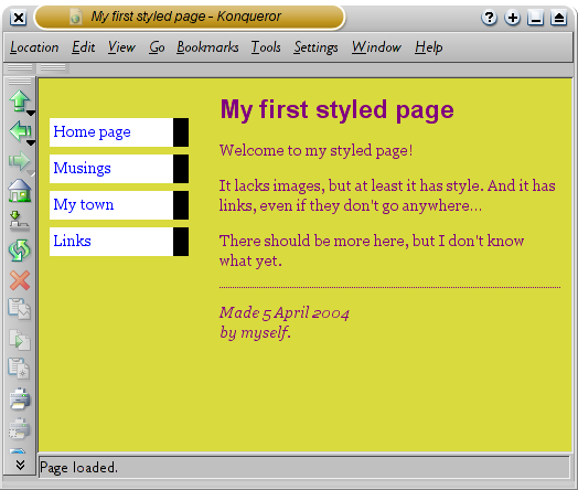
Common tasks: links
To make it easier for users to browse in hypertext
documents, the links should have a style that distinguishes them
from normal text. HTML browsers have often underlined hyperlink
text. Also, various color schemes have been used to indicate if
the user has previously visited the link or not. Since hyperlinks
are such a fundamental part of the Web, CSS has special support
for styling them. Here's a simple example:
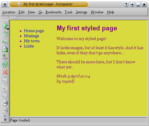
A:link { text-decoration: underline }
The above example specifies that unvisited links
should be underlined:
The links are underlined, as we have specified,
but they are also blue, which we have not. When authors do not
specify all possible styles, browsers use default styles to fill
in the gaps. The interaction between author styles, browser
default styles and user styles (the user's own preferences) is
another example of CSS's conflict resolution rules. It is called
the cascade (the "C" of CSS). We will discuss the cascade below.
The selector (
A:link) deserves
special mentioning. You probably recognize "A" as being an HTML
element, but the last part is new.
":link" is one of
several so-called pseudo-classes in CSS. Pseudo-classes are used
to give style to elements based on information outside of the
document itself. For example, the author of the document can't
know if a certain link will be visited or not. Pseudo-classes are
described in detail in Chapter 4, and we'll only give a few
more examples here:
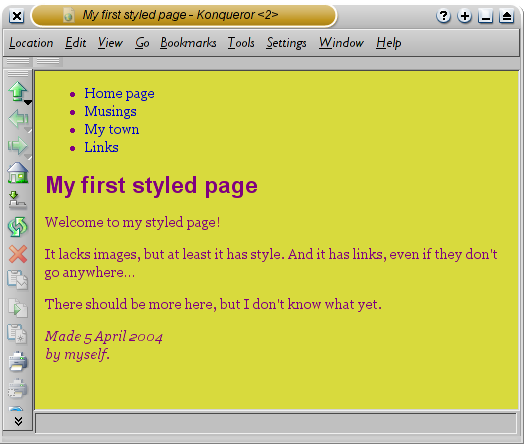
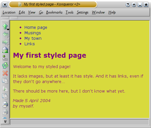
A:visited { text-decoration: none }
This rule gives style to visited links, just like
A:link gave style to unvisited links.
Here is a slightly more complex example:
A:link, A:visited { text-decoration: none }
A:hover { background: cyan }
The last rule introduces a new pseudo-class :hover. Assuming the user is moving a pointing device (like
a mouse), the specified style will be applied to the element when
the user moves the pointer over ("hovers" over) the link. A
common effect is to change the background color. Here is what it
looks like:
The :hover pseudo-class has an
interesting history. It was introduced in CSS2 after the hover
effect became popular among JavaScript programmers. The
JavaScript solution requires complicated code compared to the CSS
pseudo-class and this is an example of CSS picking up effects
that have become popular among Web designers.
A word about Cascading
A fundamental feature of CSS is that more than one
style sheet can influence the presentation of a document. This
feature is known as cascading
because the different style sheets are thought of as coming in a
series. Cascading is a fundamental feature of CSS, because we
realized that any single document could very likely end up with
style sheets from multiple sources: the browser, the designer, and
possibly the user.
In the last set of examples you saw that the text color of the
links turned blue without that being specified in the style sheet.
Also, the browser knew how to format
blockquote and
h1 elements
without being told so explicitly. Everything that the browser
knows about formatting is stored in the browser's
default style sheet and is merged
with author and user style sheets when the document is displayed.
We have known for years that designers want to develop their
own style sheets. However, we discovered that users, too, want the
option of influencing the presentation of their documents. With
CSS, they can do this by supplying a personal style sheet that
will be merged with the browser's and the designer's style sheets.
Any conflicts between the various style sheets are resolved by the
browser. Usually, the designer's style sheet will have the
strongest claim on the document, followed by the user's, and then
the browser's default. However, the user can say that a rule is
very important and it will then override any author or browser
styles.
We go into details about cascading in Chapter 15, "Cascading and
inheritance." Before that, there is much to learn about fonts,
space and colors.

![[image]](https://www.w3.org/Style/LieBos2e/enter/0.png)
![[image]](https://www.w3.org/Style/LieBos2e/enter/anatomy-rule.png)
![[image]](https://www.w3.org/Style/LieBos2e/enter/anatomy-decl.png)
![[image]](https://www.w3.org/Style/LieBos2e/enter/anatomy-diag.png)
![[image]](https://www.w3.org/Style/LieBos2e/enter/1.png)
![[image]](https://www.w3.org/Style/LieBos2e/enter/anatomy-tree.png)
![[image]](https://www.w3.org/Style/LieBos2e/enter/2.png)
![[image]](https://www.w3.org/Style/LieBos2e/enter/3.png)
![[image]](https://www.w3.org/Style/LieBos2e/enter/4.png)
![[image]](https://www.w3.org/Style/LieBos2e/enter/5.png)
![[image]](https://www.w3.org/Style/LieBos2e/enter/6.png)
![[image]](https://www.w3.org/Style/LieBos2e/enter/7.png)
![[image]](https://www.w3.org/Style/LieBos2e/enter/8.png)
![[image]](https://www.w3.org/Style/LieBos2e/enter/9.png)
![[image]](https://www.w3.org/Style/LieBos2e/enter/10.png)
![[image]](https://www.w3.org/Style/LieBos2e/enter/11.png)
![[image]](https://www.w3.org/Style/LieBos2e/enter/12.png)
![[image]](https://www.w3.org/Style/LieBos2e/enter/13.png)
 โดยทั่วไปแล้ว บราวเซอร์จะแสดงลิงค์ด้วยการขีดเส้นใต้และใส่สี
โดยปกติสีที่ใช้จะเหมือนกับสีที่ระบุไว้ในที่นี้ คือ
สีฟ้าไว้สำหรับลิงค์ไปยังหน้าที่คุณยังไม่ได้เข้าไปดู
(หรือที่เคยเข้าไปดูเมื่อนานมาแล้ว)
สีม่วงไว้ใช้สำหรับหน้าที่เข้าไปดูมาแล้ว
โดยทั่วไปแล้ว บราวเซอร์จะแสดงลิงค์ด้วยการขีดเส้นใต้และใส่สี
โดยปกติสีที่ใช้จะเหมือนกับสีที่ระบุไว้ในที่นี้ คือ
สีฟ้าไว้สำหรับลิงค์ไปยังหน้าที่คุณยังไม่ได้เข้าไปดู
(หรือที่เคยเข้าไปดูเมื่อนานมาแล้ว)
สีม่วงไว้ใช้สำหรับหน้าที่เข้าไปดูมาแล้ว


